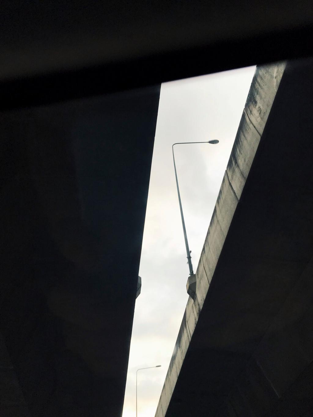
Compose the City: Composition Tips for Urban Architecture Photography

Chosen theme: Composition Tips for Urban Architecture Photography. Step into the streets ready to organize steel, glass, and light into meaningful frames. Explore practical, imaginative composition tactics and share your results—subscribe for prompts, critiques, and fresh urban challenges.

Perspective Mastery: Vanishing Points and Distortion Control

Aim the lens straight down an alley so lines converge to one vanishing point, amplifying depth. Place a small subject near the endpoint to create scale and purpose within the receding corridor.

Perspective Mastery: Vanishing Points and Distortion Control

Tilt-shift lenses preserve verticals, essential when authority and clarity matter. Without one, step back and shoot wider, then correct perspective gently. Keep a touch of convergence if it serves mood and dynamism.

Perspective Mastery: Vanishing Points and Distortion Control

From ground level, structures loom heroically; from rooftops, patterns flatten into pleasing maps. Test both viewpoints. A parking garage roof once transformed tangled streets into elegant, deliberate lines framing a copper spire.

Light as Architecture: Timing, Direction, and Contrast

01

Blue Hour Symmetry and Calm

During blue hour, the sky’s cool wash simplifies color, letting illuminated windows become rhythmic punctuation. Reflections soften harsh edges, so symmetrical compositions feel serene, precise, and surprisingly human despite monumental surroundings.
02

Harnessing Harsh Noon for Graphics

Midday isn’t a villain. Use hard light to carve deep, graphic shadows under overhangs and fire escapes. Expose for highlights, then let silhouettes dramatize façades like bold ink strokes on paper.
03

Reflections as Compositional Allies

Glass towers, puddles, and polished stone multiply viewpoints. Place your subject in a reflection to layer reality and echo geometry. In Chicago, a rain puddle doubled a skyline, perfecting an otherwise plain foreground.

Framing with the City: Foreground, Layers, and Depth

Foreground Storytelling That Guides

Include bollards, bikes, or street plants to anchor the bottom edge, leading attention inward. A parked scooter once became an arrowhead, pointing cleanly toward a mosaic doorway glowing in late sun.

Layering Dense Streets with Clarity

Stack near, mid, and far elements while simplifying each layer’s role. Keep the subject clean of tangencies. A pedestrian pause between lampposts separated planes beautifully, clarifying the building’s distinctive crown line.

Natural Frames in Built Spaces

Use archways, scaffolding, or stair railings to encircle your subject. Frames add intimacy and context. Wait until passing traffic clears so your frame feels intentional rather than cluttered or hurried.

Color, Texture, and Minimalism

Color Blocking Downtown

Seek two or three dominant colors and arrange them in strong shapes. A red bus slicing across muted concrete can anchor a powerful diagonal, transforming an ordinary corner into decisive geometry.

Texture-First Visual Narratives

Brick, oxidized copper, terrazzo, and ribbed metal each photograph differently. Side light reveals grit; front light flattens. Compose so textures converse across the frame rather than shouting over each other.

Minimal Frames, Maximum Intent

Subtract until only the essential remains: one plane, one shadow, one accent. Centering can work when the subject is iconic. Negative space invites viewers to breathe and finish the story themselves.

People in the Grid: Scale, Motion, and Ethics

Tiny Figures, Monumental Context

Place a small person against towering columns to clarify size. Time their step to align with repeating elements. A single umbrella beneath a dome once made the entire nave feel alive.

Motion Blur that Complements Structure

Drag the shutter to blur pedestrians while keeping architecture sharp. The static grid becomes a stage, motion becoming narrative, not noise. Use railings or walls to brace and maintain crisp edges.

Editing with Intent: From Frame to Cohesive Series

Use crops to eliminate tangencies, strengthen diagonals, and refine balance. If a crop damages essential leading lines, return and reshoot. Intent beats compromise when architectural structure is the story.

Editing with Intent: From Frame to Cohesive Series

Selective contrast can reveal stone grain or glazing patterns. Avoid global crunch that crushes subtle tones. Maintain believable color so compositional relationships remain the viewer’s primary guide through the frame.
Mjsnapstudio
Privacy Overview

This website uses cookies so that we can provide you with the best user experience possible. Cookie information is stored in your browser and performs functions such as recognising you when you return to our website and helping our team to understand which sections of the website you find most interesting and useful.